
The explosion in user adoption of mobile devices has revolutionized the web. Though designing for the Mobile Web follow similar principles to designing websites, we must consider some notable differences. For one, current mobile device networks don’t run in the same speed as broadband devices.
In addition, there are also a myriad of ways our mobile web designs are displayed in, from touch screens to netbooks, which make even the smallest desktop monitors look like giants. Some might argue that going mobile isn’t necessary yet, however, what no one will disagree with is that it’s an inevitable turn in the profession of people who make and run websites. If you’re considering developing mobile web designs (or pushing an existing one onto the Mobile Web), this article should help you get to grips with the growing trend of mobile design.
Delivering the Design
One of the early elements that need to be considered for producing a mobile-device-friendly site is the way the experience will be delivered. You want to make your web design to be extremely responsive.
Complications in Delivery Method
The ideal scenario would be that each device simply scales and adapts to your existing website — and some devices, such as the iPhone, are able to because of their built-in web browser.
But because of so many devices out there, a cross-device mobile design is difficult to make. If you thought that developing sites that work on most web browsers such as IE, Firefox, Chrome, and Safari was tough — try developing one for iPhones, BlackBerrys, Palm Pres, Androids, Motorola devices, Nokia devices, and — the list appears bottomless! For desktop-based web designs, you only had one markup language to deal with: HTML.
But on the Mobile Web, there is also WML and then platforms such as iOS for Apple devices and Android for Android devices. 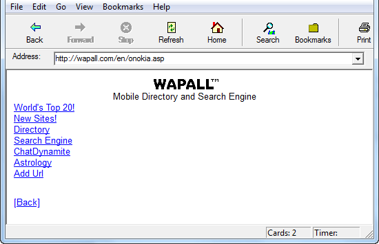 WML used to limit our design creativity, but we have more flexibility these days.
Adapting a Web Design to Support Mobile Devices
One option to pushing a site to the Mobile Web is to simply create or modify your existing code and design to work well on mobile devices, or building from scratch with mobile devices in mind. With a bit of CSS3 (using media queries), for example, you can rescale the dimensions of your layout depending on the user’s device.
The problem is — you guessed it — not all devices support CSS3. So you may have to resort to using server-side device detection (e.g. HTTP headers to sniff out the user agent) or using JavaScript (e.g. modifying the DOM to rescale your layouts).
But again, some devices might not support these techniques.  Making an existing layout scale depending on the viewport is as simple as a few lines of CSS3.
Redirect Mobile Users to a Mobile Version of the Site
Another method for delivering a mobile design is to build an especially optimized layout for handheld devices. You can build this yourself or use a web service such as Mobify.
Compared to the first method, this is the better format for delivery as you can create an experience specifically for your mobile users without taking away from the experience of desktop users. For this to work, you will have to route traffic on your site depending on the user’s browser agent. For example, if a mobile device user visits your site (yousitename.com), then they will automatically be redirected to, say, mobile.yoursitename.com or m.yoursitesname.com.
 A separate mobile site can mean squeezing out the extra bytes for faster rendering.
Tips on Redirection
Whichever route you decide to go down, it’s important that:
- Visitors know that a mobile-friendly version of your site is available
- Visitors can have the choice between a mobile version or the normal version
While forcefully redirecting or changing the layout for your end-users may seem like a good idea, it can lead to frustrations, so there should be ways in which a mobile device user can view the normal site design, and vice versa. A simple solution would be to provide a link that goes to either version of a website. For example, on Six Revisions, you can find a link to the mobile version (m.sixrevisions.com) in the footer of the regular website, and conversely, a link to the regular website is provided at the footer on the mobile version. Whether you’re a mobile device user or a desktop user, you have access to both sites.
Structure and Code
The next thing that we need to consider is the structural code (markup and styles) that goes on behind the scenes.
- Do you go with a mobile-friendly language like WML or the XHTML mobile profiles?
- Do you build an app for iPhones, and then one for the Android?
- How does the cost and speed associated with mobile device web browsing affect the way you should develop your design?
- What about modern standards like HTML5 and CSS3?
These are just some of the questions that we all have in this relatively uncharted and undeveloped territory when working on an effective web design.  New devices may not support the same code as older mobile handsets.
Choices
Choosing the right language for a mobile-friendly website is paramount; while older devices before the smartphone revolution only support WML (which is pretty basic) the W3C produced a mobile-friendly version of XHTML (referred to as the XHTML Mobile Profiles). Luckily, due to the speed in which mobile device manufacturers have taken to giving a complete and robust web experience, you can often simply use regular HTML or XHTML — if you don’t want to be held back by mobile profiles or WML.
However, it’s important to underscore the fact that it’s still worth considering WML if you feel your visitors have old phones. Remember, though, you’ll be adding more web zombies that we’ll all have to deal with some day. Use your site statistics and carry out some website analytics to help you come up with an educated decision.
 Every browser will have its own level of support (it’s not all about the device itself).
Speed and Cost (to the User)
Ultimately, whichever language you choose, the primary considerations you need to think about is speed and user cost. It’s well known that most mobile internet providers cap connections, and therefore bandwidth has now become a limited and valuable resource. Even worse is the issue that roaming charges outside of the country you reside in can be expensive, which is a reason to keep the sizes of everything on your site as low as possible. With caps, costs and speed issues, the need to keep markup as clean, small and standards-based as possible is important.
 Roaming charges from mobile web providers can get pretty expensive. Because of the speed in which adoption is occurring for new technologies, the ability and future of using languages like HTML5 and CSS3 is not out of the question — taking into account that your code degrades gracefully, of course. Many providers such as Apple provide firmware upgrades that improve how the device will function, which means older devices may be able to take advantage of modern standards. But this situation is analogous to IE6 users refusing to upgrade to modern versions like IE8, therefore, ensure you always research before you implement — then test, test and test again!
Layout Essentials
If there’s one issue that mobile devices have in spades, it’s the issue of how to lay out your web pages.
A design’s layout in mobile devices is problematic because:
- Mobile devices come in all shapes and sizes
- Mobile devices have different levels of quality and resolutions
- Mobile devices may or may not support zooming, others scroll content
- Scrolling in mobile devices is more difficult because of their small screen
The goal of a mobile web design’s layout is to allow the least amount of burden to the user’s ability to find (and quickly read) what they’re looking. Essentially, your layout will be important to making your mobile presence a success.  Due to the lack of space on many screens, single column designs may be required.
Simplicity
One of the main concepts to an effective mobile web layout is simplicity.
It goes without saying that the more information you pile into a small space, the harder it becomes to read and the more scrolling that will be required. With such limited space to contend with, multi-column layouts often break because the required space to meet the needs of the content cannot span beyond the physical space of the viewport unless passive zooming and scaling comes into play. Therefore, it pays to use a single column layout.
Avoid Scrolling
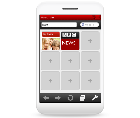
Some mobile devices, like the iPhone and iPad, have the ability to adjust a web page’s zoom depending on the orientation of the device (portrait or landscape mode), which reduces the need for scrolling; but not all devices have this ability.
 Having to scroll down a content-heavy page isn’t a fun experience on cell phones. We all know that horizontal scrolling isn’t a good idea — especially on the iPad where scrollbars don’t show up until you attempt to scroll — so avoid this situation in your mobile web designs.
  A good mobile design should have a clean layout with simple navigation options.
Size of Navigation and Clickable Objects
Another key component is the issue of navigation and clickable regions, which is predominantly a problem with touchscreen mobile devices. I’m sure if any of you have big hands, you are well aware of what a pain typing on a handheld keyboard can be or how hard it is to click on something small on the screen without having to zoom into it.
Ensuring that your mobile layout has large and easy-to-press links and clickable objects will be essential in streamlining the experience. Reducing the amount of clicks required to achieve an action — which is a good practice regardless of whether or not you’re designing a mobile site — is all the more important in mobile web designs.
Content Design
With the cost of browsing the web and caps on data allowances being put in place (along with speed issues), the most costly component of a website is the content.
Knowing how to reduce excess images, text and media can be the difference between a 50KB design and a 2MB layout of crippling intensity. 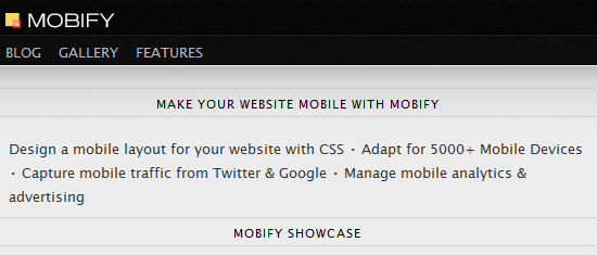 Less is more on a mobile device; less content equals more likely to read.
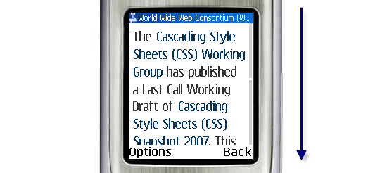
Text Content
Of all the components of a site, none plays a more vital role than the text. But while content is king even on handheld devices — the need for scrolling, small file sizes, quick readability and bandwidth restraints means that we have to re-engineer our copy to ensure that it’s useful on such devices.
If your design is simply a modification/adaptation of your existing layout (the first method of delivery), you could decide to hide unnecessary text, images or media (even though they’ll still download, it will improve readability). The real advantages come from a separate design where you can purge the marketing talk and excessive content.
Images
When working with a small screen, large CSS background images or byte-heavy infographics can be problematic.
While some handheld devices have larger displays where this is not an issue, and while the ability to zoom into graphics on devices like the iPhone shouldn’t go without some credit, unnecessary bulk for visual embellishments certainly needs to have a good clean up. 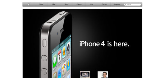 Large images sap a lot of bandwidth; consider scaling them back for smaller screens. Reducing the resolution and dimensions of your images can literally be the difference between 50KB and 500KB — bandwidth consumption that’s worth saving.
Video/Audio
It’s inevitable in the modern web that utilizing audio and video will be needed.
Even with the bandwidth issues that exist, you shouldn’t stop using these richer forms of content, as they can be great, especially on handheld mobile devices that have excellent video/audio quality such as the iPhone or iPod Touch. But just like with everything else, moderation and smart usage is key. There are a few considerations you should make when utilizing video and audio:
- The format you use: Beware of Flash and other closed formats that aren’t compatible on some devices
- The file size of video and audio: Optimize your files
- Don’t automatically download video/audio files until requested: For bandwidth savings
- Don’t auto-play: It’s annoying; in fact, don’t do this even outside of mobile devices
Other Issues to Consider
Finally, it’s important we address the best practices when it comes to scripting, plugins (like Flash and Silverlight), and developing web apps. Knowing what to cut and what to keep will help enhance your mobile user’s experience and also ensure that your mobile website is functional across most/all devices.  Allow your code to degrade gracefully as you can’t rely on any technologies success rate.
Interaction in Mobile Devices vs. Personal Computers
An important point to make is that we interact differently with a mobile design screen versus a regular computer screen. With the lack of a mouse and the way our hands gesture to instigate actions and reactions, the traditional interaction patterns we’re accustomed to, such as hovering over a link (for example), is different. Consideration must be given to how such functions are affected by a change in interfaces.
Proprietary Technologies and Plugins
The move of Apple to block Flash from their devices underscores the problems of becoming dependent on proprietary plug-in components — closed technologies that other companies can’t or won’t support. 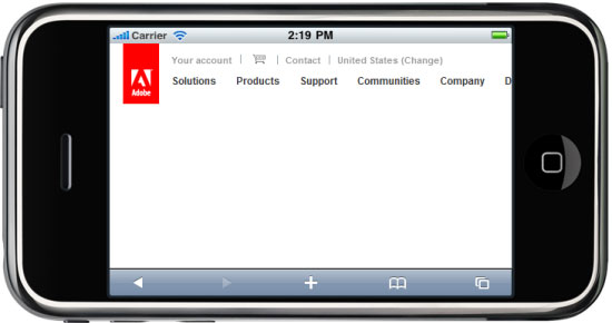 Adobe Flash isn’t supported on the iPhone, iPad or iPod Touch, which is problematic. Apple’s decision against Flash can be a harbinger of things to come, setting a precedence about the way mobile device manufacturers welcome third-party technologies into their own. Other technologies like Silverlight or Java may not work as intended — or may later be blocked as well.
While many developers may use this as an excuse not to develop on these platforms, the best course of action is simply to ensure that their mobile websites degrades gracefully.  Building an app may be useful if internet access is unavailable (for any reason).
Web Services with Persistent Internet Connections
Even though the availability of web-based services are fantastic, I do worry that the dependence on a constant and reliable (always on) web connection is very much going to be a problem for web apps at the current state of mobile device networks. While there have been moves towards local storage mechanisms, for now, web apps that rely on persistent internet connections could affect mobile device users due to the capabilities of their networks. For example, the fact that there are still “dead zones” — places where mobile phones don’t have service — can affect the user’s interaction, such as in cases where his or her signal suddenly drops in the middle of performing a task.
It’s worth considering the idea of developing an app for your service which can function both offline and online (learn how by reading this offline HTML5 iPhone app tutorial).
Testing Your Mobile Website
If you’ve ever been into a store that sells phones, it can be downright shocking how diverse the screens, devices and contract plans can be.  There are a wide range of emulators for simulating your designs. With the future set to bring even more mobile devices into the fray, and because we are at the mercy of corporations that want to gain or maintain their competitive edge, the standardization of these web-enabled devices is unlikely to occur. Therefore, it’s up to our common senses to do what we can to ensure that the widest possible audience can access and use our site in a way that’s functional and enjoyable.
Testing with Mobile Device Emulators
With such diversity in the mobile device landscape, it goes without question that you should test your designs on as many platforms as you can manage. Below is a list of emulators that will simulate certain devices for you to be able to test your work.
- Android emulator
- Blackberry emulator
- Dot Mobi emulator
- Firefox Mobile emulator
- iPhone / iPad / iPod Touch emulator
- Klondike WML emulator
- LG emulator
- Microsoft Devices emulator
- Motorola emulator
- Mozilla Fennec emulator
- NetFront emulator
- Nokia emulator
- OpenWave emulator (archive)
- Opera Mini emulator
- Opera Mobile emulator
- Palm emulator
- Palm Pre / iPhone emulator
- Samsung Java emulator
- Samsung Platform emulator
- Windows Mobile emulator
Simple, Small and Speedy
While much of what I discussed in this article is straightforward advice, common sense is a major factor that dictates how we build interfaces. Back in the 56k modem days, we had speed issues to contend with. We also had monitors that were limited in resolution and color.
Many ISPs capped our bandwidth and internet access. Some internet connections would drop if you have an incoming phone call to your house. So for those of you older-generation developers — you should be in familiar territory.
For now — and until mobile network infrastructure improves and connectivity is widely available — simple, small and speedy are the three main principles we should abide by.
Related Content
- Mobile Web Design: Is it Worth It?
- A Quick Look at Mobile Web Designs
- How to Make an HTML5 iPhone App
- Related categories: Web Development and Web Technology
-
 President of WebFX. Bill has over 25 years of experience in the Internet marketing industry specializing in SEO, UX, information architecture, marketing automation and more. William’s background in scientific computing and education from Shippensburg and MIT provided the foundation for MarketingCloudFX and other key research and development projects at WebFX.
 -

WebFX is a full-service marketing agency with 1,100+ client reviews and a 4.9-star rating on Clutch! Find out how our expert team and revenue-accelerating tech can drive results for you! Learn more
Make estimating web design costs easy
Website design costs can be tricky to nail down. Get an instant estimate for a custom web design with our free website design cost calculator!
Try Our Free Web Design Cost Calculator
Share this article


Web Design Calculator
Use our free tool to get a free, instant quote in under 60 seconds.
View Web Design CalculatorMake estimating web design costs easy
Website design costs can be tricky to nail down. Get an instant estimate for a custom web design with our free website design cost calculator!
Try Our Free Web Design Cost Calculator